
This article was originally posted on my linkedin profile, in the article section.
As I’ve been recently spending a lot of time reading about stock price, stage analysis and financial fundamental analysis, I decided to give it a go with Python, using public information about stock prices within the healthcare and biotech domain, using Python. Code is my own, apologize in advance if you find ways to make it more efficient (classes, functions) or improve runtime.
Objective
Let’s use Python to build a very rudimentary tool helping to decide if we want to buy / sell / hold a stock.
Disclaimer
This post is purely educational and does NOT aim at giving any recommendation whatsoever regarding business nor trading. It’s focusing on showing some Python technical possibilities. If you want to find any business recommendation, you’ll be deceived. All information and data used is PUBLIC and free of access. I am also NOT a trader, do NOT use this information to trade. You may feel free to replicate and improve the code below but I already DECLINE all responsibility. The below is only my own and does NOT reflect in any case my employer.
While stock market analysts’ notes and recommendations are worth reading, it’s always good to think by oneself and forge one’s opinion, especially when it comes to financial topics. As such, playing around with the numbers definitely helps and you might find here some inspiration to track your portfolio’s performance.
Stock picking within the healthcare industry in this post
COVID pandemic affected at different level industries: biotech companies and healthcare industry have been under the spotlights as the world expected a cure against COVID-19.
Biotech & healthcare companies’ stock prices have been logically mirroring this context.
The below list is arbitry and aims at picking up a few stocks within the industry. We’ll consider 9 tickers for the present analysis:
- Pfeizer (NYSE: PFE)
- Novo Nordisk A/S (NYSE: NVO)
- Gilead Sciences, Inc. (NASDAQGS:GILD)
- Regeneron Pharmaceuticals, Inc. (NASDAQGS:REGN)
- West Pharmaceutical Services, Inc. (NYSE:WST)
- DexCom, Inc. (NASDAQGS:DXCM)
- Moderna, Inc. (NASDAQGS:MRNA)
- Abiomed, Inc. (NASDAQGS:ABMD)
- PerkinElmer, Inc. (NYSE:PKI)
Again, the list could have been different and in the end, for the present article, the choice doesn’t really matter. It could be any other industry or vertical (fintech, for example 🙂 ).
As expected in this kind of industry, the list is skewed toward large market capitalizations: Pfizer has a market cap at ~ $207B (large cap), Novo at ~ $163B, Gilead’s market cap is at ~ $71B (large cap), Regeneron at ~ $51B, Moderna at ~ $44B. PerkinElmer’s market cap is smaller at ~ $15B (but still considered as a large cap).
Why using Python?
Stock screeners or even Excel can be used too, but since (1) Python already offers a wide range of libraries dedicated to financial analysis, (2) programming is good to automate procedures and scale any analysis framework and finally (3) Python is fun, there is no reason why not giving it a go.
I will share the code along the way, step by step.
Let’s kick off!
The first step is to plot directly the stock price evolution.
In order to retrieve the stock prices, we’ll use a library called yfinance. It might not be the best module, but it’s free and it will do the job for what we want to do.
Let’s have a look. We retrieve directly the stock price of each ticker since Jan 2017, per day, and store them into a dataframe.
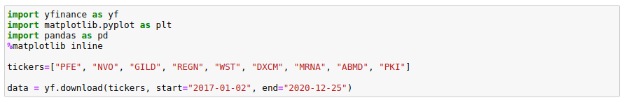
We plot them to get a visual feeling of the trend.
These shares’ stock prices followed slighlty different patterns after the Q1 ’20 covid-related market plunge: some accelerated more than others, some lost momentum. Some stocks like Dexcom (DXCM), Regeneron (REGN) or West (WST) strongly increased from March to August before losing momentum in Q4. Starting in November, Moderna (MRNA) literally skyrocketed.
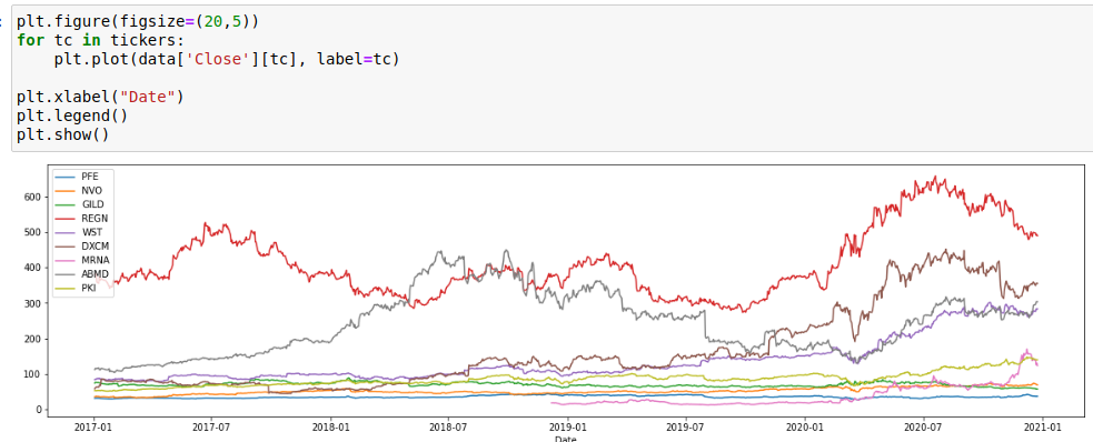
Let’s consider their overall stock price evolution from March 2, 2020 (pre-pandemic spread) to December 21, 2020; just to compare their simple return rate / growth rate (%) between these 2 dates.
The visualization however still unclear and lacks of details. We can improve it.
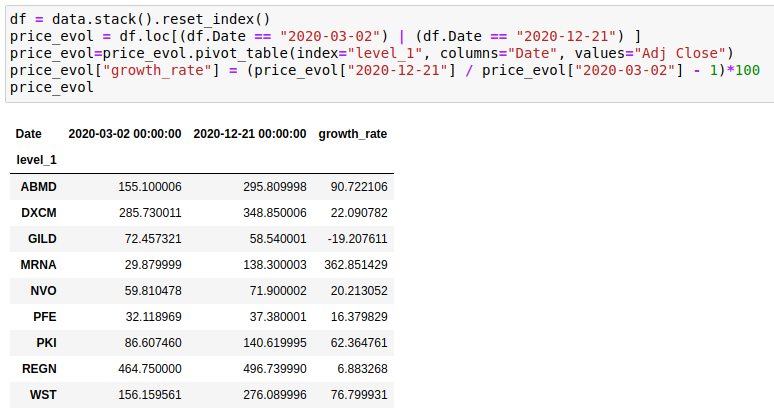
Not all companies traded at the same price in March, so it’s hard to see the evolution in details. To fix that, we can use march 2, 2020 as index 100 and calculate the subsequent stock prices relatively to it.
This gives in Python the following:
This is interesting as it tells a complementory story.
Once indexed, visually, we can see the rally experienced by Moderna’s stock price. West (WST) and Abiomed (ABMD) followed almost the same growth pattern.
How to clearly establish these relations, beyond just a feel?
We can use a correlation matrix.
In Python, with the support of the seaborn library, this is as easy as :
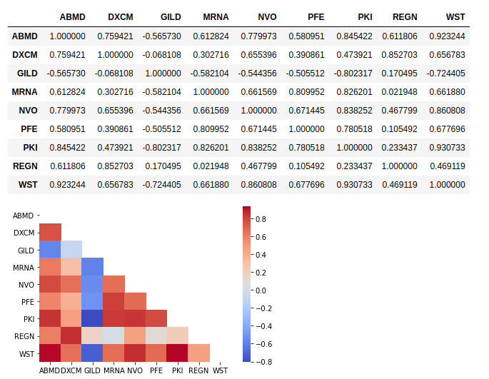
What we could feel from the visual plot is now materialized through the correlation score.
How to interpret this?
The closest the correlation score is to 1 or -1, the strongest the correlation will be between 2 stocks. Red = very strong correlation; Blue = little correlation
So this is confirmed, West and Abiomed had a strong stock price correlation. Same for PerkinElmer (PKI) and West. Gilead (GILD) moved independantly. Same for Regeneron (REGN).
In terms of risk mitigation and portfolio arbitrage, we might not want to own too many shares which tend to be too correlated.
In the present case, we limited ourselves to a short list of only 9 stocks. Correlation matrix in Python becomes handy when you have hundreds of them and you need to do an arbitrage!
Using the SMA as trading signal
Simple Moving Averages can be used as trading signal. Stan Weinstein’s so-called “stage analysis” popularized the methodology. Weinstein’s trading method is more complex than just using the moving averages:
- Volumes traded must be taken into consideration, such as a sudden significative increase
- Numbers should be weekly and not daily
- Stock price performance should be compared to a similar-industry index (Masfield Relative Strenght)
- (… non exhaustive criterias)
It also breaks out each stock price evolution into 4 distinct phases; however for this piece of analysis, we’ll just focus on SMAs. You could use also more complex moving averages such as EMA or WMA.
(again: read the disclaimer)
For each ticker, we will calculate the simple moving averages (SMA) over 30 and 200 rolling days and we will plot them.
So we have the following charts:
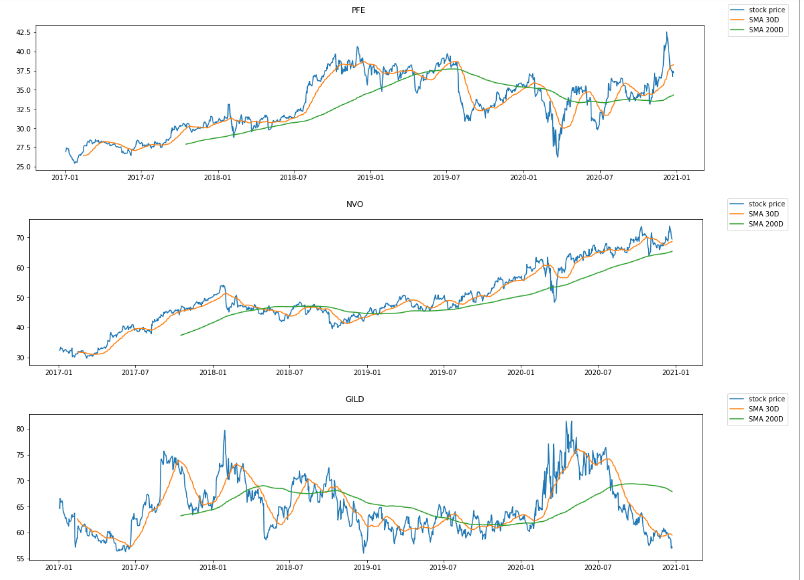
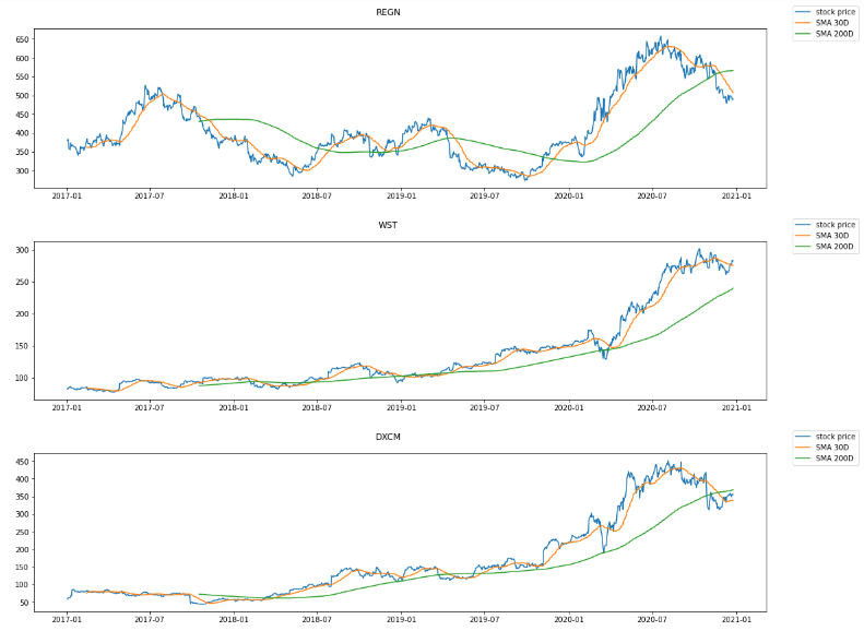
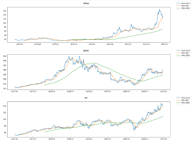
Novo (NVO) , Moderna (MRNA) and PerkinElmer (PKI) have a stock price higher than their SMA 30D and a SMA 30D higher than their SMA 200D, which is one of the component among thousands that technical traders use in order to detect a stage 2. Moderna’s rally however seems to be over if we look at the latest days of December.
That’s nice, but we might want to have a clear report, based on some rules, helping us in deciding when to short or long the position on each ticker. We don’t want to review manually hundreds of stock price and SMAs.
So let’s do this.
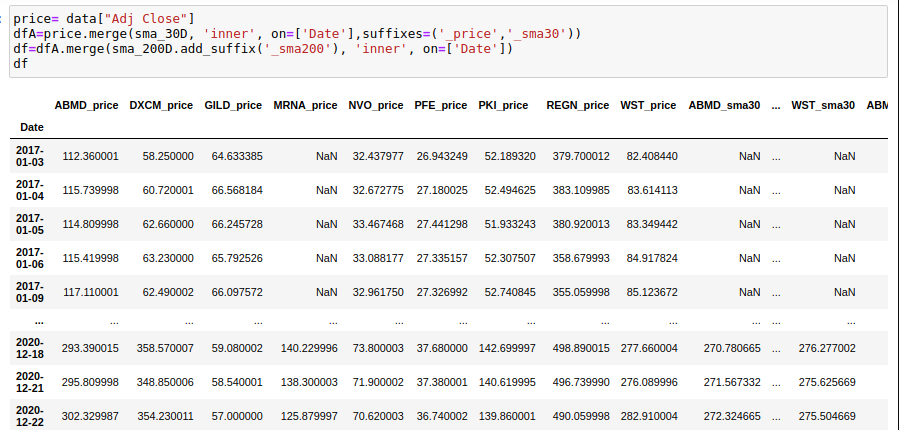
We will start by combining all the dataframes (daily stock price, SMA 30D and SMA 200D) into one single dataframe. Then we’ll implement some rules to get a ‘buy/sell/hold’ signal. These rules will be rudimentary as this is just an example.
Rules we will use will be:
- If sma 30 > sma 200 (positive long trend) and price > sma 30 (positive short term trend) then BUY
- If price < sma 30 and sma 30 < sma 200 then SELL
First we’ll combine in one single dataframe for each ticker, their stock price, sma200 and sma30
We now can calculate the score and design a colored table to show the result. Green will be BUY, Red = SELL and the beige in the middle is simply an HOLD position. (Please re-read the disclaimer).
To make it easier to read, I filtered the table to cover the last 60 days only. The most recent date is at the first row.
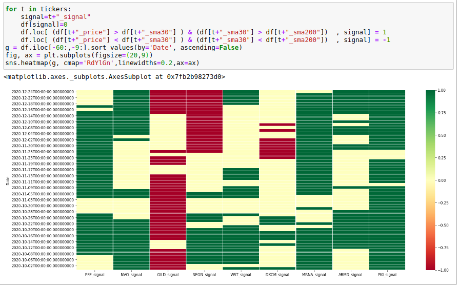
We know have a very simple scoring model which could be updated every day to support trading position.
Remember: this is purely educational and too simplistic to be used and in reality, we might want to complexify this score and factor in other metrics such as RSI, Volume or DMX/DI.
To go further: let’s calculate the log returns
We have the stock price. We can now play around and calculate not only the simple return rate but also the log return.
The advantage of calculating a log return is that it allows to add/sum the returns computed throughout the time serie (this is however not valid at portfolio level), which you absolutely cannot do with a simple return.
An investor will seek for the log return to be >0
Simple return = R = P1 / P0 – 1
An example would be: the stock price is $100 on a particular day, the following day, it quotes $120, the simple return will be +20%.
Log return = r = ln(P1/P0) = ln(P1) – ln(P0)
log return with the same example will be ln(1+20%)=18.23%
To go from log return to simple return, just use: EXP(r) – 1
So exp(18.23%)-1 = 20%
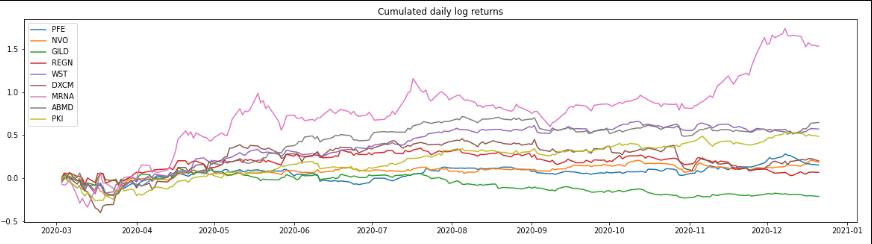
So let’s re-use the examples of stocks between March 2, 2020 and December 21, 2020.
We will do the following for each stock price:
- Compute the daily log return
- Add this log return via the cumsum function
- For the last cumulated log return data point (on date of Dec. 21, 2020), we’ll convert them back to simple return rate.
And now the results – look at the comments: we convert back the cumulated log return to the simple return rates we calculated previously.
Now, we could use this log return within our lightweight scoring we calculated previously, to enrich the score.
Other parameters to factor in before picking up a stock
Market timing is hard and stock exchange requires the “4G” as said once André Kostolany, the stock exchange guru who speculated during 80 years before passing at age of 93: “Geld, Gedanken, Geduld and .. Glück” which we can translate by : “Money, Thoughts, Patience and .. Chance”.
- Industry / market general performance
- Company’s relative performance vs. its pairs within the same industry: P/E but also P/E G to factor the expected growth
- Earning growth general trends
- Management quality & financial quarterly / yearly notes to investors
- Debt-to-quity ratio, to understand how debt is being leveraged
- Dividend distribution
Conclusion
I hope this was useful. This was just a demonstration of what’s possible to do with a few line of codes.
This really becomes handy when you have multiple portfolios and need to track their performance very often to perform some arbitrage.